New Website 2020: Design
Design
I have to admit that even though I’m a Frontend Developer, designing is the thing I enjoy more than development. The reason I became a developer is that as a designer without any coding skills, all your ideas stay ideas unless another developer brings them to life.
The good thing with a personal project is there are no limitations, and you’re the customer. No compromises that water down an idea, no real-world boundaries that prevent doing everything as it should be done.
When I started working on my website, I wanted to do the project as it should be done, and that means, you start with the content.
Content First
I preached this for years to my customers when they hired me to create a website for them: Content is King. Without content, you don’t have anything. Lorem ipsum placeholder text is a bad idea. You need to know your content to design it. I always cursed when a customer said: You can start designing, we send the text and photos later.
These websites always ended in a bad product.
In 2018, I created nearly all the text for my website. It took long hours to hone down the text until it was short enough, content-rich, and precise in its meaning. I write all my texts with iA Writer, because of the minimal interface, focus mode, Markdown support, and plenty of other features for writing.
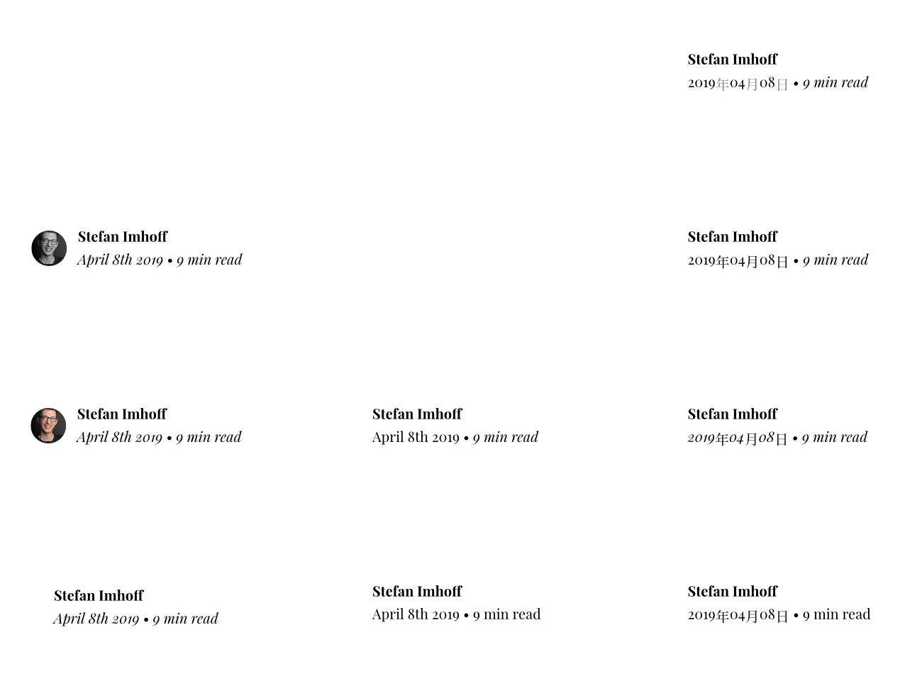
I hadn’t written articles for a long time and wanted to change that. In 2019, I started again regularly to create content for my website. I introduced the new format of a monthly blog post listing my favorite links, videos, movies, or books of the month.
After all the political clashes and problems with censorship and policing content creators on the major social media websites, I decided that a website is the best and future-proof investment into a living and diverse internet.
Medium is not your website, it’s another person’s website. Everything you write on Medium or elsewhere on Social Media platforms is not yours—sometimes even written bluntly in legal small-print—and can be taken down, censored, or banned if somebody disagrees.
The internet can survive if we move it back to the people and invest in decentralization: Your website instead of Medium, your news list instead of your followers, a RSS feed instead of a stream of content, Matrix instead of WhatsApp.
Everything controlled by a company can (and will) get corrupt, disappear, or be changed at any time without you being able to do anything about it. Your livelihood might disappear overnight because YouTube decides to rank the algorithm differently.
I’ll continue to use social media to extend my reach, but I moved my content back to my platform.
Typography
The next thing I moved my attention to was Typography. I always loved Typography and have many books on the topic, including the famous The Elements of Typographic Style by Robert Bringhurst. There is a shorter, free version available tailored to the usage of typography on websites: The Elements of Typographic Style Applied to the Web.
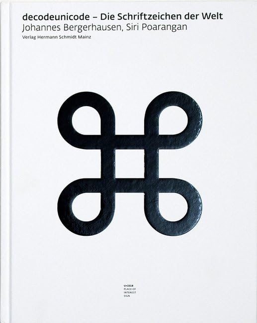
I even own a copy of the 650 pages strong Decode Unicode, a book listing all 137,374 typographical characters, from the Armenian capital letter Ayb to the Khmer Letter Ka. There is even a complete website showing all characters and a two-and-a-half-hour-long movie showing all characters.

Typeface
I looked long into free options of good-looking and well-designed typefaces. I wanted to avoid including a paid font, that needs constant payment and an external server because they load slowly and tracking is nearly always included.
After long consideration, I picked the beautiful Playfair Display by Claus Eggers Sørensen. It’s available from regular to black weights. It was converted to a variable font in 2019 (but I didn’t find a use case for that yet).
I like in particular the italic font with the beautiful loops and curves. I picked its companion Playfair Display SC for small caps, used in abbreviations and acronyms.
Scale
Next, I picked a Typographic Scale. A scale is a way to pick font sizes based on a fixed set of rules, for example, a specific harmonic number or formula to create a harmonic visual image. I decided to go with the golden section (ratio 1:1.618).
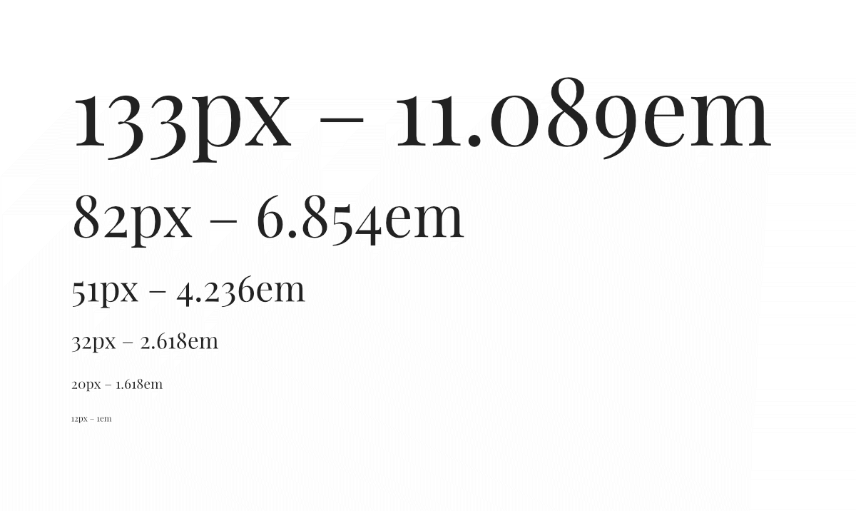
I picked 20 Pixels as the base font size. Furthermore, I’m in my forties and websites pick fonts far too small. The company iA Inc. wrote 2006 the essay The 100% Easy-2-Read Standard, but still, fonts below the recommended 16 Pixels of browsers are a standard.
Ligatures and Other Gems
Playfair Display has a few beautiful ligatures—when two letters as fi get combined in one beautiful combined letter: fi—which look fantastic on large headlines.
I decided to go for hanging punctuation on block quotes and lists, where the quotation mark or bullet list item is moved into the marginalia. This creates a much more harmonious image of the text than using regular punctuation. And as in my previous website, I created the quotes with CSS, fitting to the language of the quote, including sub quotations.
However, I made a huge mistake while creating the font and repeated the mistake on the grid (more on that later) which took later in the development time to correct: I didn’t think about the responsiveness of the web. I was clear about creating a responsive website, but I didn’t anticipate that a fixed size scale might not work with a responsive website without adding dozens of media queries. That’s why I started designing with a fixed size scale and moved later to fluid typography.
At that early stage, I had thought of a substitution font while loading the web font or if web fonts are disabled. I selected Georgia because it has a similar size, width, and character.
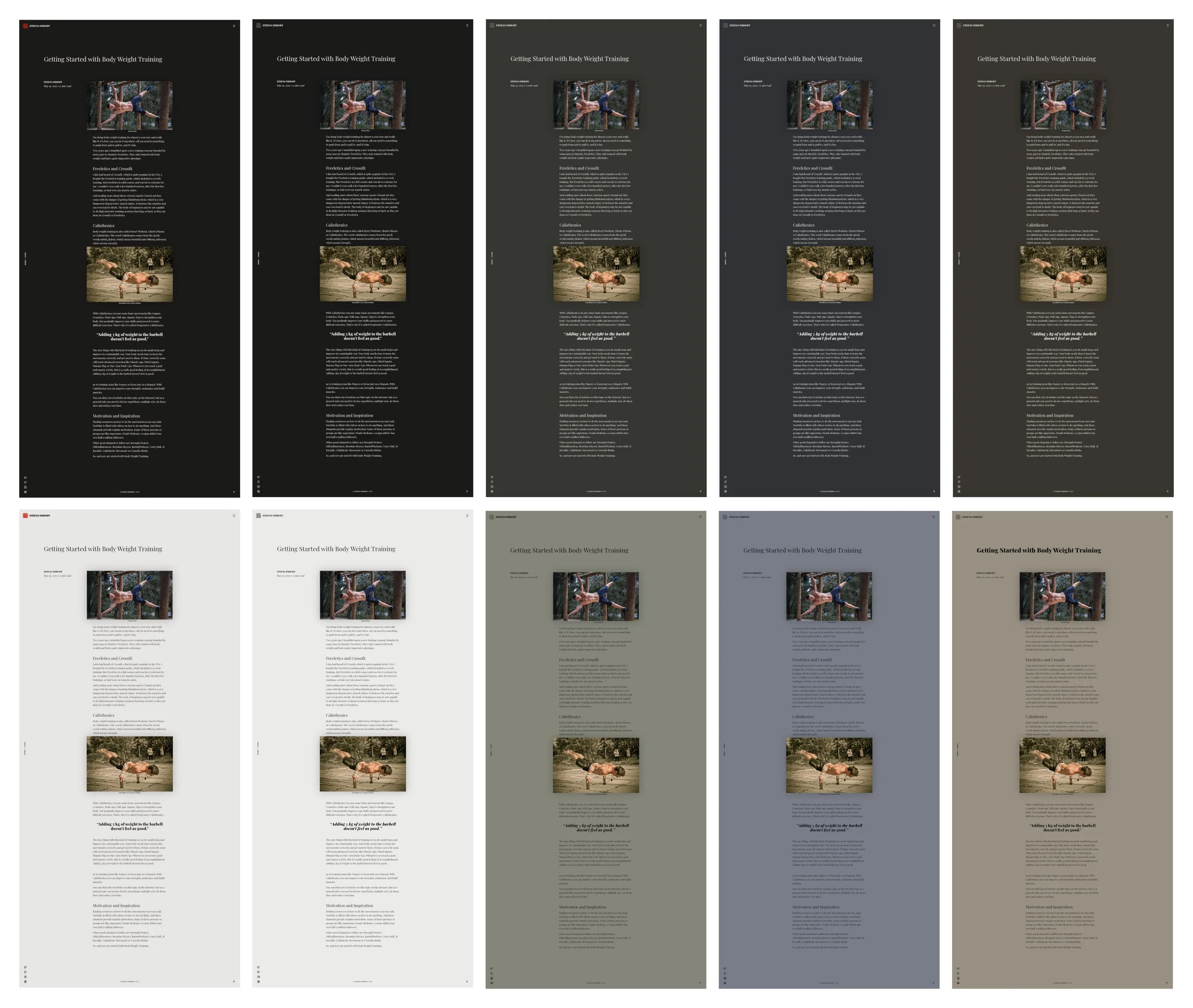
Color
I wanted my website to have the color of Japanese Washi (和紙) paper. Early on, I knew that I would support a dark and a light theme. I tried to limit myself to a few colors: One accent color, background color, and foreground color. Additionally, I created variations of these with different intensities.
HSL Color Space
I picket the HSL color space, to be able to quickly create variations of my colors. In HSL, the first value H stands for Hue. Red is 0°, and then each color is represented by a value on a circle. The S stands for Saturation and is a value between 0% (gray) and 100% (full saturation). The L stands for Lightness and is a value between 0% (black) and 100% (white). With all three values, I was able to create the colors I wanted: First, I picked the color hue I wanted to go for. Next, I reduced the Saturation to a value below or around 10% which I found made any color instantly look Shibui (one of its identifying features is desaturated colors). To get all the other colors, I moved the Lightness value down for a dark color or up for a light color.
Light Background
#E7E6E4
Light Foreground
#0E0D0C
Accent
#E60510
Dark Background
#1B1A18
Dark Foreground
#E7E6E4
Accent
#E60510
Color Themes
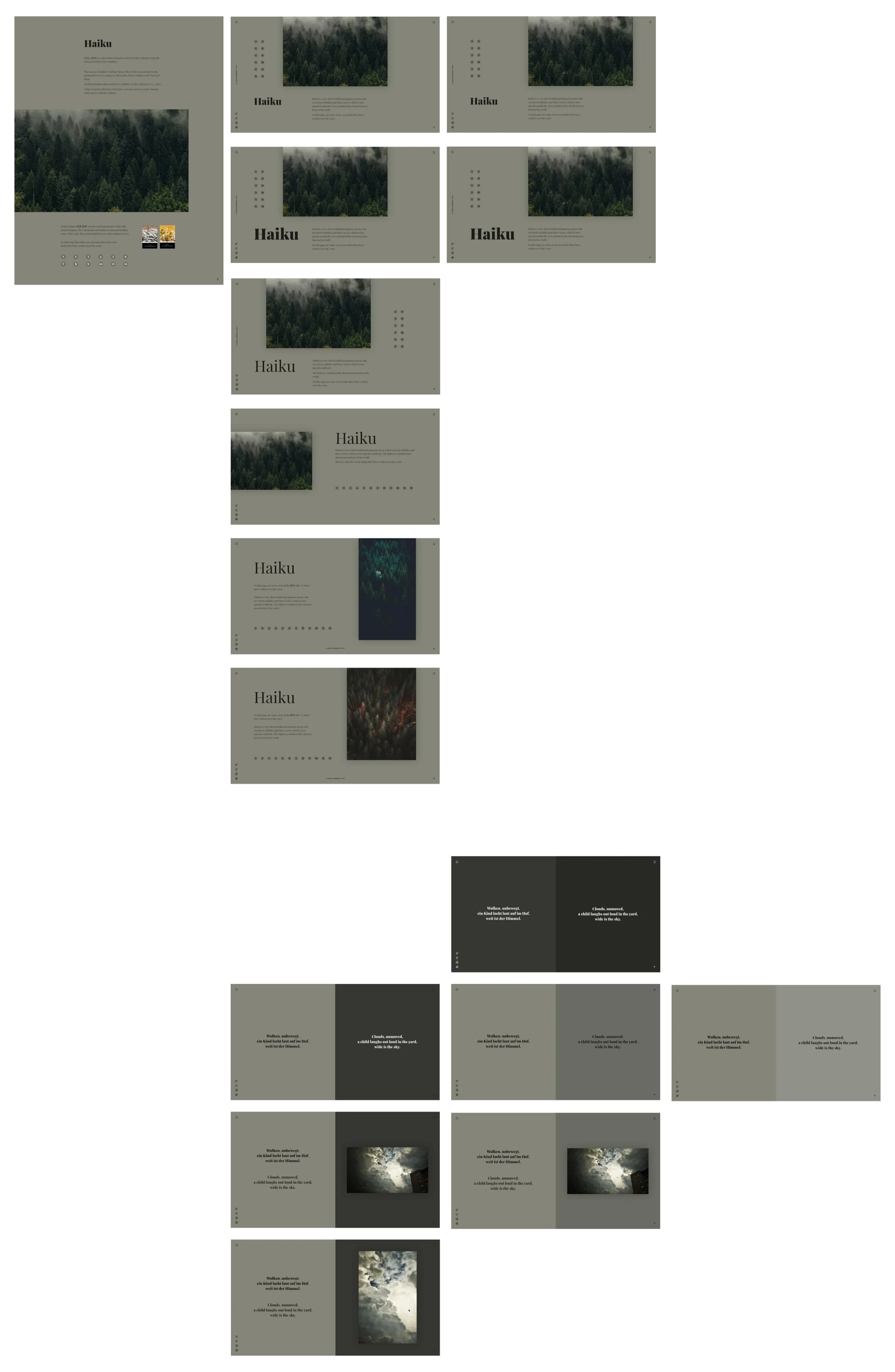
Additionally, to the main colors, I created 3 other color themes: A green one for my Haiku page, a brown one, I wanted to use for my Sketchnotes page, and a blue one I wanted to use on my projects page (but didn’t do it).
Green
Light Green Background
#858679
Light Green Foreground
#0D0D0C
Accent
#505049
Dark Green Background
#353630
Dark Green Foreground
#E7E7E4
Accent
#505049
Brown
Light Brown Background
#988F81
Light Brown Foreground
#0E0D0B
Accent
#544F45
Dark Brown Background
#38342E
Dark Brown Foreground
#E8E6E3
Accent
#544F45
Blue
Light Blue Background
#787D87
Light Blue Foreground
#0C0C0E
Accent
#484B51
Dark Blue Background
#303236
Dark Blue Foreground
#E4E5E7
Accent
#484B51
I didn’t invert colors but needed to make sure to create good contrast, which is why I handpicked dark and light colors manually. I had to make another adjustment after I launched my website, I didn’t anticipate: The white text on the dark background was far too bright. This is a known problem and there are multiple solutions to fix this. You can pick a lighter font on dark—which I didn’t want to do because of the file size of additional font weights—or reduce the opacity. I picked all light text on dark with an opacity of 0.87.
Logo
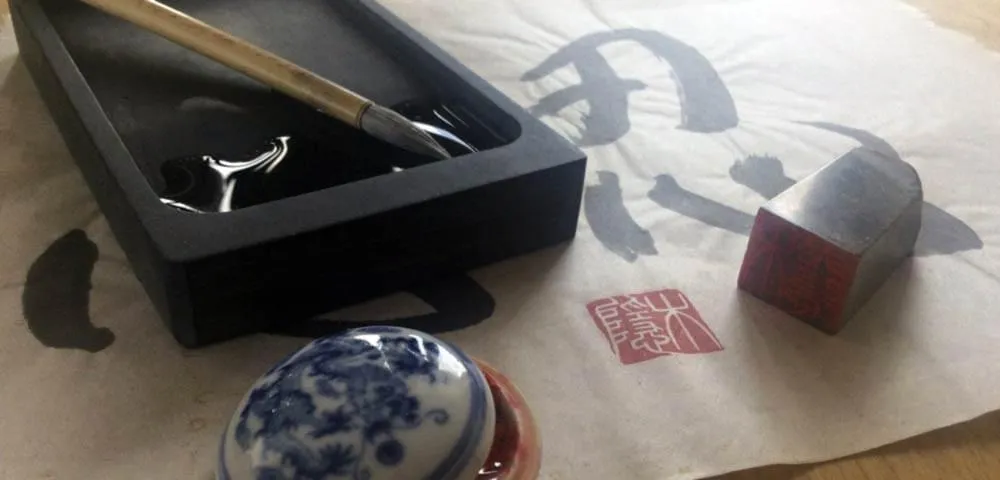
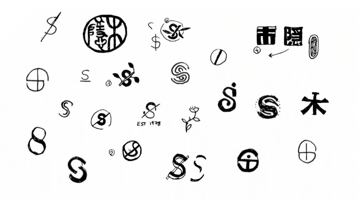
Next, I moved my focus to the logo. A logo is always a difficult topic. Do I need one? Why? What should it be? My initials? An image? It’s easy to create a cheesy logo. I used a rakkan (落款), a Japanese artist seal, for at least 10 years. An artist carved it for me into stone, using the oldest Chinese font, the small seal script, introduced by the Chinese Emperor Qin Shi Huang, 2200 years ago. It gets pressed into red ink and then applied to the artwork as the signature. I choose the characters of my internet pseudonym kogakure (木隠), meaning “hidden behind leaves”.
I created a few sketches of other possible logos, but eventually, I discarded them all and moved back to my rakkan. Likewise, I decided to simplify the vector form and reduce the number of points and make it more performant and easier to recognize in smaller sizes.
But after finishing the logo, I decided in the interest of simplicity and austerity that there is no reason to use a logo at all. I even removed my name from the header, as it’s obvious on what website the visitor is. My name is written enough around the site. The logo will appear in parts of the website, for example as an icon for the app, or on other locations, a logo fits.
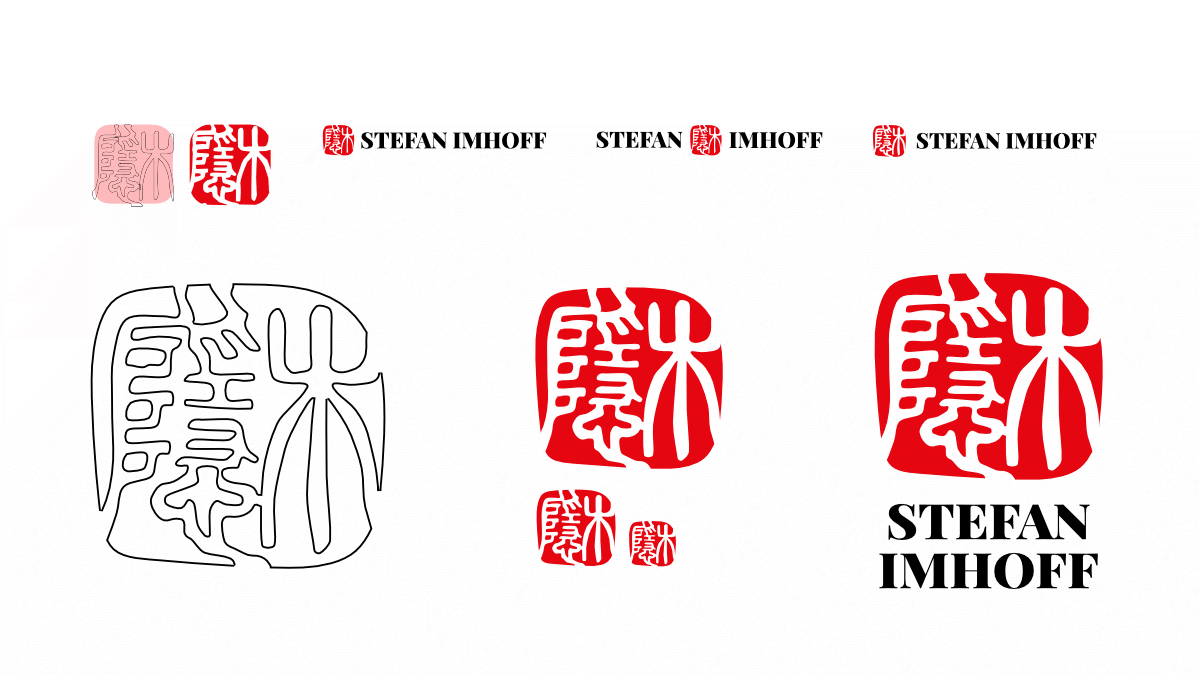
Grid
Early on I got obsessed with the Golden Canon Grid and my early designs used a complicated and sophisticated version of it.
But gradually I decided this would end in a nightmare when moving to code and migrating to a modular grid. However, I didn’t recognize my error of using a fixed-size module for the grid—an error I had to correct later.
I was sure to use the CSS Grid Layout, correctly named CSS Grid Module Level 1. Web developers like Rachel Andrew or Jen Simmons showed since the introduction of the CSS Grid what cool things are possible.
I used parts of the CSS Grid on the last redesign of my martial arts website. But nothing compared to the grid I used this time.
Unfortunately, the subgrid feature is not yet implemented in any browser besides Firefox (as of mid-2020). That’s why I needed to recreate my grid inside of grid containers to align content to its parents’ grid.
Icons
I decided to use icons sparingly and not to invest the time creating my own because, with Remix Icon, I found a beautiful, free, minimal icon system. I even created a few icon wishes for Remix Icon early on, to get icons I thought I might need later (which I didn’t).
I started my designs using a social media bar sitting in the lower-left corner. But as time moved on, I found that the services I picked changed in importance, and they were not relevant enough to justify a constant icon in the corner. The social bar had to go.
Subtle arrows and icons for specific use cases were left. I removed complex sun and moon icons for the light and dark theme switcher in favor of a simple circle.
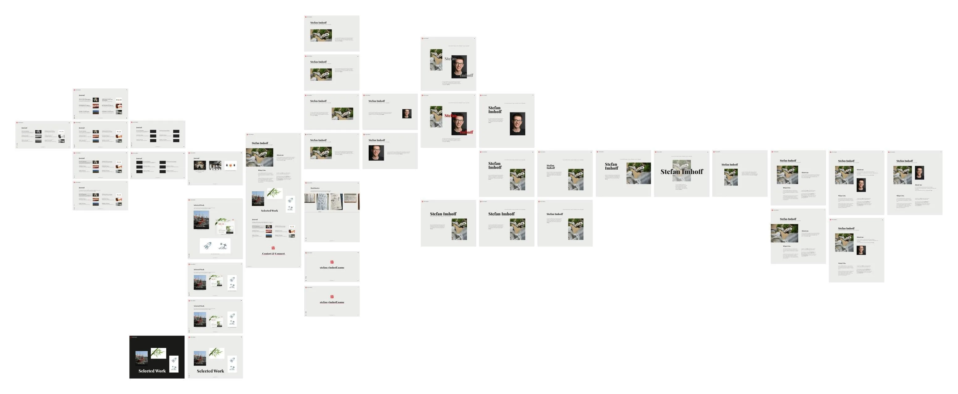
User Interface Design
In mid of 2019, I finally started with my design. I spend 3 hours on prototyping and mood boards and nearly 25 hours on the designs.
As my tool of choice, I picked Affinity Designer. I love the tool since it was first released. I worked for 15 years with Adobes products and owned multiple expensive versions of their designer software. But when Adobe thought it might be a good idea to rent software instead of selling it and forcing people to regularly pay to be able to use the tools, I moved on to other software.
And working with Affinity Designer, Affinity Photo, or Affinity Publisher is much more fun. They are performant and have many nice tools and features. And the price is unbeatable. I own all their products on Mac and iPad and can move between the tools, while designing, with ease.
I decided to use Aaron James Draplin’s method of designing. He is a talented designer inspiring millions with his artwork and author of Draplin Design Co.: Pretty Much Everything.

As he shows in the fantastic free video, Aaron Draplin Takes On a Logo Design Challenge, he starts in the middle with an idea and then duplicates the whole version and iterates on it. If he reaches a dead end, he moves back to the last junction and moves from there in another direction. In the end, he has one giant board with dozens of variants and ideas, none of them worked into good craftsmanship or details, but keeps everything loose and ungrouped to be able to manipulate the individual pieces.
I followed this technique on all my designs and created dozens of variations, sometimes entire pages, sometimes a small detail as the footer or a meta section.
Designing was the part that brought the most fun to me. Designing is like a concert: It starts with a cello, but then more and more instruments get added until the full concert ends in a massive crescendo. The start is always the hardest, with the designer staring at a blank, white screen. But then things fall into the place and ideas multiply and in the end, everything is obvious, and the next screen is easy to create.
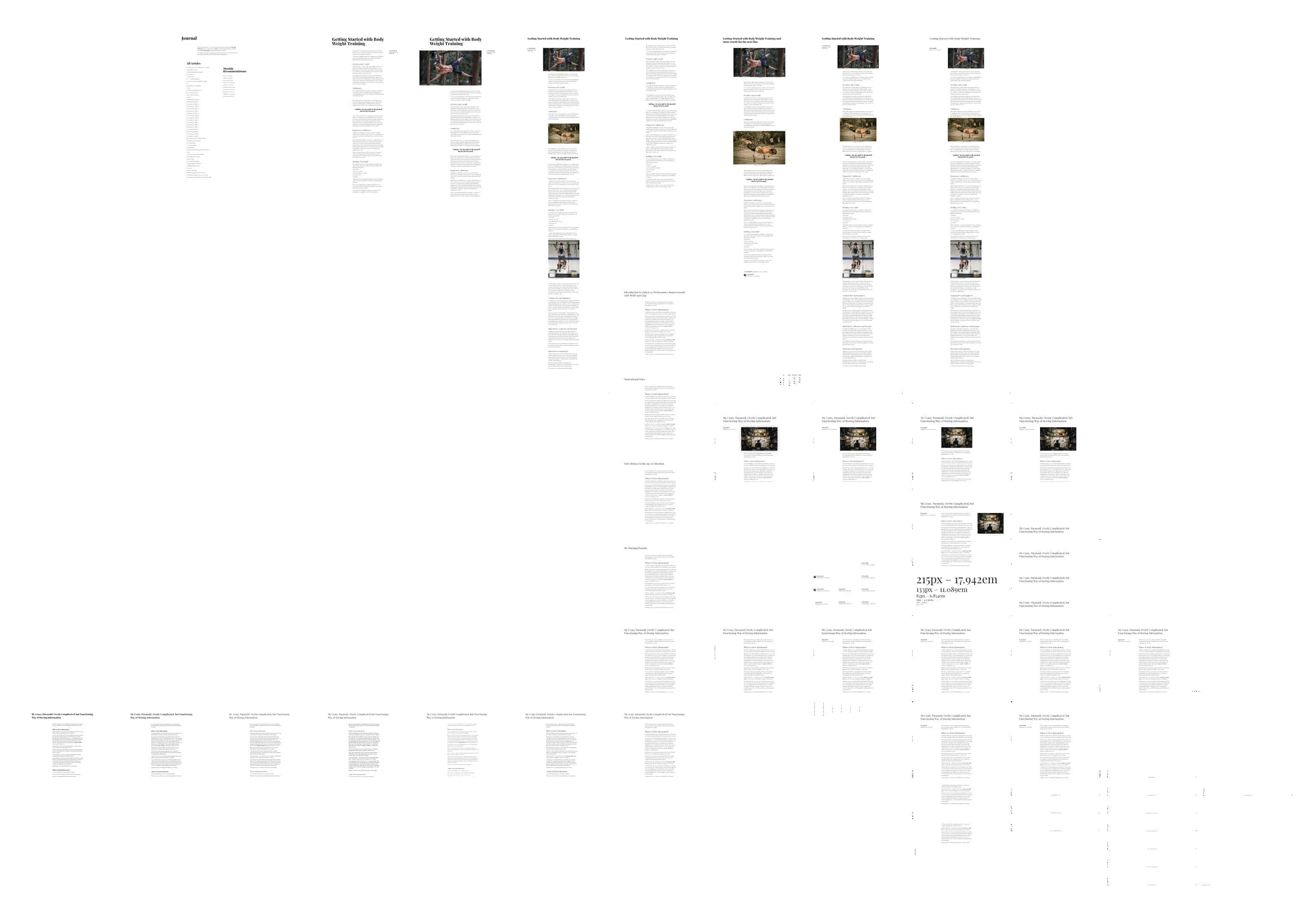
I started designing the blog detail page headline and moved out from there, creating text, header, footer, and small details.
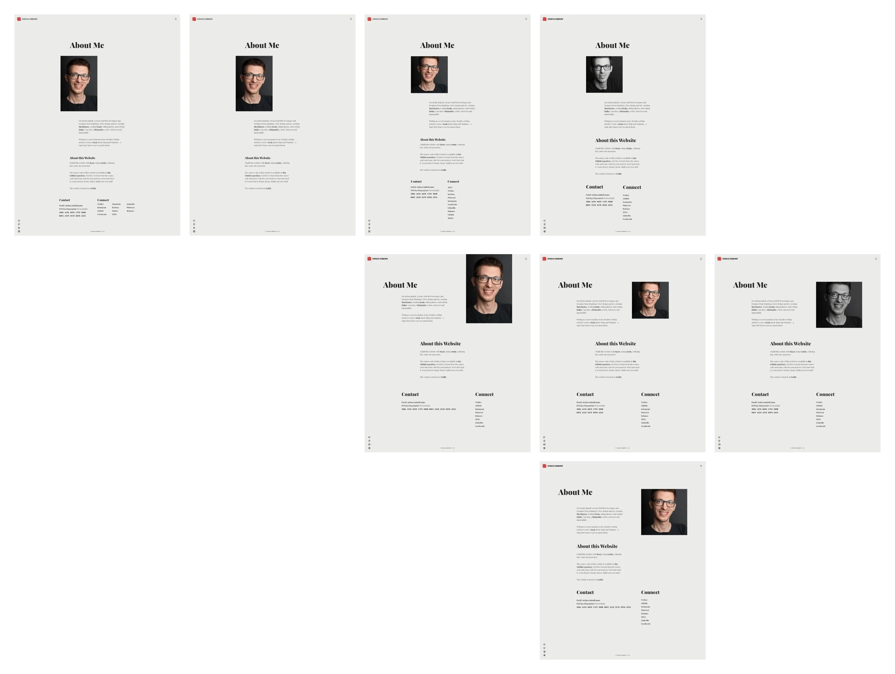
Then I moved into color variations for the pages. I designed error pages, navigation, special pages, and the homepage last. I didn’t design every detail, but quickly moved from idea to idea, leaving behind a mess of unnamed layers and incomplete or outdated ideas.
I created a giant design for all layout variations I wanted to support on a page (e.g., the combination of an image and a text). I moved quickly to CodePen to create prototypes for these variations to validate my ideas where feasible. You can see all my prototypes on my CodePen account.
In the fall of 2019, I finished my design and left it for a few weeks untouched to see if I start disliking it. On the 25th of November 2019, I finally started coding.