New Website 2020 – Inspiration
How Japanese aesthetics shaped my site

At the end of 2017, I had the wish to create a new website, as my old design and technology got dated. I started by collecting inspirations and ideas about the direction I wanted to go.
In 2017 and 2018 I didn’t do a lot, but browsing inspiring websites, and looking into trends and styles. I was sure to pick a Japanese-inspired topic, as all my website designs had one: My first design was inspired by Japanese Tattoo (Irezumi), my second design was based on the topic Bonsai and my martial arts website uses Bamboo as a recurrent theme since 1999.
Japanese Aesthetics & Design
I looked into Japanese Design styles, Typography, and Editorial Design as resources of inspiration—not only websites, but all kinds of design, from packaging, graphic design, architecture, and interior design to traditional Japanese art styles.
And as I always collected designs and saved them on boards or put them in folders on my computer, time went by, and I removed designs again and added new ones. A few designs I liked even after a few months or even a year, but others I quickly became bored with. To better understand why one design is quickly getting boring and others always keep my interest and tension, I decided to do a small excursion into Japanese design. I read nearly everything I could get my hands on. After one and a half years and eight books later, I knew a lot more about Japanese design.
Books on Japanese Design
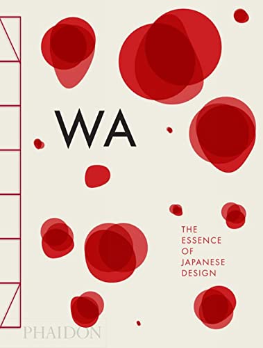
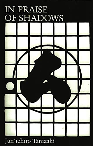
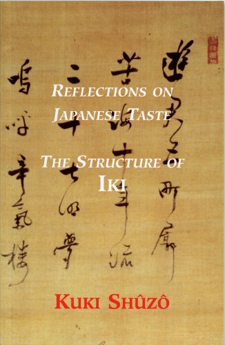
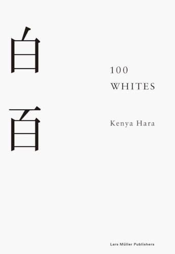
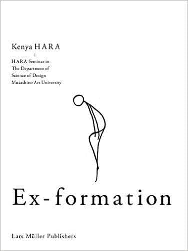
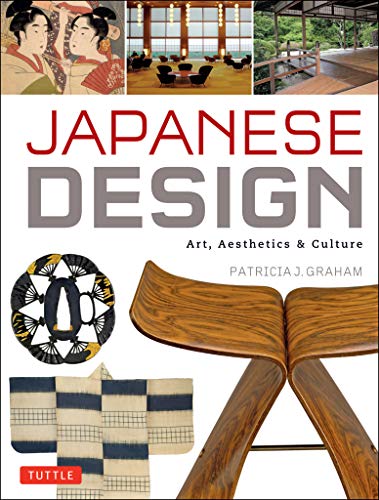
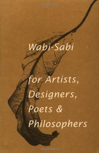
I read all books from Kenya Hara, the art director of Muji, and one of the leading designers of Japan. Additionally, I read the old and famous books In Praise of Shadows by Jun’ichirō Tanizaki and Reflections on Japanese Taste: The Structure of Iki by Kuki Shūzō. I read a compendium on all major Japanese currents of Art and Aesthetics, from glamorous gold-loaded styles to minimalistic Zen styles. I mapped out my research in detail in this mind-map.


Shibui – Subtle Elegance
After looking into all the different art forms, I decided to follow my feeling and picked the style of Shibui. Shibui (渋い, adjective), shibumi (渋み, noun), or shibusa (渋さ, noun) means translated bitter or astringent taste but has additionally the meaning of subtle elegance, refined and unobtrusive, quiet and simple, and understated. It’s the opposite of amai (甘い, adjective) which means sweet.
It has its origins in the Muromachi period (1336-1573). In this period fell the Ōnin War (応仁の乱, Ōnin no Ran), a ten-year-long war that destroyed immense amounts of cultural value, beautiful art, statues, and temples. The Shōgun Ashikaga Yoshimasa handed over the power to his son and retired to the area of Kyoto and spend his life reflecting on taste and aesthetics. The new simple and quiet art forms emerged, likely out of philosophical resignation about the cultural loss.
By the seventeenth century, it had become a distinct sense of beauty. It’s closely related to the art form of wabi-sabi, but should not be confused with it.
Wabi-sabi (侘寂) is an aesthetic art form that focuses on the beauty of old and broken things and is closely related to Zen Buddhism. Many wabi-sabi objects are shibui, but not all shibui objects are wabi-sabi.
It’s a complicated concept—and I don’t have the feeling of understanding all the aspects. What makes it even more difficult is that these art forms are connected over a complicated network with different philosophical or religious ideas, for example, Shintō, Buddhism, or Daoism.
Shibui consists of seven aesthetic principles, sometimes called The Shibui Seven:
- Asymmetry – fukinsei (不均斉)
- Simplicity – kanso (簡素)
- Austerity – koko (考古)
- Naturalness – shizen (自然)
- Subtlety – yūgen (幽玄)
- Unworldliness – datsuzoku (脱俗)
- Tranquility – seijaku (静寂)
Fukinsei – Asymmetry (不均斉)
One of the concepts is asymmetry. This style is a trend in 2020, but countless designers copy the style without understanding what makes it beautiful. The philosophical concept behind this is the idea of imperfection and irregularity. Nature creates random things that look chaotic, and humans create something straight and geometrical. Asymmetry is placed in the middle: intentional imperfection. Zen has a similar concept in Ensō, the imperfect circle, drawn by a calligraphist with a brush.
The concept can be seen in Japanese Gardens, where rocks of different sizes are placed in a pattern that looks not orderly but still perfect. The observer takes part in the creative process by completing the uncompleted in their mind.
When I created the concept for my design, I tried to integrate all seven concepts into the website. I used a lot of asymmetry in my layout, by moving photos or text on the grid to not be aligned strictly geometric.
Kanso – Simplicity (簡素)
The concept of simplicity is the most known, as Steve Jobs—who was Zen Buddhist and loved this simplicity—used the concept for Apple products.
It’s similar to the concept of Bauhaus, though its origin and philosophy are different. Bauhaus (and other similar art forms) tried to contrast the previous gorgeous decorations of royalty and replace them with something new as these powers declined.
Simplicity means the elimination of confusion, things not necessary, removal of decoration, and keeping things in a simple, plain, and natural way. All non-essential things are suppressed or excluded. At the same time, you create more space. A lot of today’s industrial design follows this concept.
I tried to keep my design as simple as possible, while at the same time optimizing the content for maximal information density. The website has no unnecessary elements, the navigation is as short as possible.
Koko – Austerity (考古)
Austerity is closely related to simplicity. It means intentionally limiting a thing to fewer options or exclusion and omission. Transferred to design, it could mean limiting oneself to a few colors or one font. Or it could mean removing unnecessary things from the design. You don’t add something, that is not necessary.
It’s interesting to note that there are studies that prove that fewer options lead to more sales, for example. And people tend to be happier with fewer choices. It’s a slim zone between having no options and too many options.
I rolled back ideas multiple times because they integrated too much complexity. I removed a social icon bar I added in my early designs, removed fancy off-screen navigation, replaced complex icons with simple ones, and limited myself to a maximal amount of navigation items.
Shizen – Naturalness (自然)
Naturalness is a core concept built into Japanese life. Even the traditional houses create with their paper sliding doors (shoji) a fluid barrier between the outside and the inside. Nature is always welcome and part of life.
Naturalness means the absence of sham and artificiality. It can be achieved by integrating naturally occurring patterns and rhythms into a design. This could, for example, mean using natural colors or color combinations.
To cover this concept, I use subtle shadows and scaling effects to produce the effect of real-world elements. I selected photography and natural colors, typical shibui colors, identifiable by their high amount of grayness. I experimented long with colors until I found the shibui formula. Thanks to the HSL color space, I’m now able to shibuify any color.
Yūgen – Subtlety (幽玄)
This concept is one of the hardest to grasp, as it’s a feeling and emotion. It means subtle grace or hidden beauty, but can best be described by explaining poetic expressions:
It could be the feeling when the moon is behind the clouds and suddenly the clouds move away. Or a swarm of wild geese that are suddenly hidden by a cloud. An island on the horizon and a boat moving behind the island. It might be the feeling of wandering on and on for hours in a great forest without the thought of return.
Yūgen is described as an awareness of the universe that triggers an emotional response too deep and powerful for words. The Japanese language has a lot of these words. Take for example ikigai (域外), the reason for being, or komorebi (木漏れ日), sunlight filtering through trees. Or funny words like age-otori (上げ劣り), the bad feeling one gets after a terrible haircut, or deeply sad mono no aware (物の哀れ), the pathos of things—the awareness of the transcendence of all things, that everything will perish and disappear.
In design, yūgen can be achieved by limiting information enough to arouse curiosity and leave something to the imagination. I use photos cut off by the fold of the screen, inviting visitors to scroll. Content appears after you scrolled it into the viewport. Page transitions and scroll animations add further to this concept.
Datsuzoku – Unworldliness (脱俗)
The concept of unworldliness means something that transcends the conventional. Something happening, that gives you the feeling of surprise and excitement. The moment you realize that you can have freedom from conventions.
Examples could be a car breaking down, trains don’t drive, you are getting sick, or you are seeing something unexpected. Something that interrupts everyday life.
In design, this could be anything unusual, things the viewer wouldn’t expect. Something funny on a serious website or items not correctly placed. Ideas you wouldn’t expect in a given context.
I hid multiple Easter eggs around the website (in a previous version) for the unworldliness and unconventional and added one idea I had never seen on the internet before. You could previously click on any date and switch between English, German and Japanese formats. Additionally you could turn on Emoji mode on one hidden page and reveal hidden Emoji all over the page. I removed these features, when I turned the React page into a static page.
Seijaku – Tranquility (静寂)
The last concept of shibui is tranquility. The feeling of stillness, quietness, and solitude you can have while sitting in a Japanese garden. Time for reflection or active rest.
If you’re able to make the viewer stop or reflect—slow down—on a piece of design or art, you achieved this concept.
The last concept I cannot guarantee, but I hope the depth of the website and its many hidden gems slow down and invite relaxed exploration.